Although rFactor 2 (rf2) is highly rated for its physics and force feedback, it has lagged behind sim rivals such as Assetto Corsa Competizione (ACC) in the user interface (UI) department.
Despite being the platform of choice for some of the most competitive sim racing events in the world, including the 24 Hours of Le Mans Virtual and Formula Pro, players have often complained about having too many confusing menus to negotiate.
Concerns over the menu loading speed and transition are also valid, requiring developer Studio 397’s attention. Finally, the team has obliged by releasing an all-new UI update, launched on 27th February.
A beginning (An Ascent)
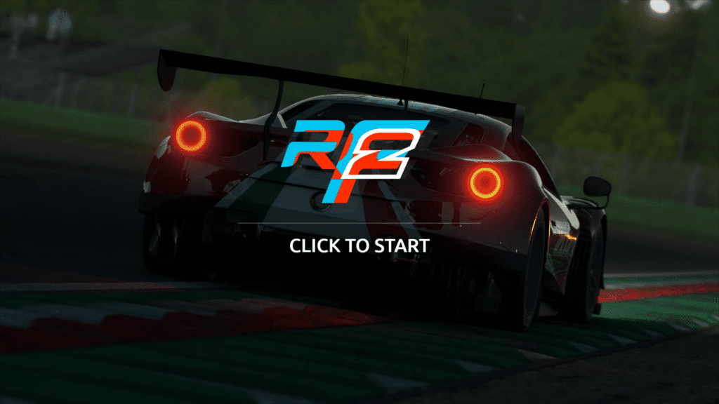
Firing up rFactor 2’s new update for the first time presents a bit of a shock – there’s music!
And, in my opinion, it’s really well done. The soundtrack is breathy and a little Brian Eno-esque, all moody synth with an infusion of V10. In other words, it captures the mood of a racing sim perfectly, where licensed music would make it feel like you’ve just stuck a commercial radio station on in the background.
Forget Formula Pro, this is Formula Zen.
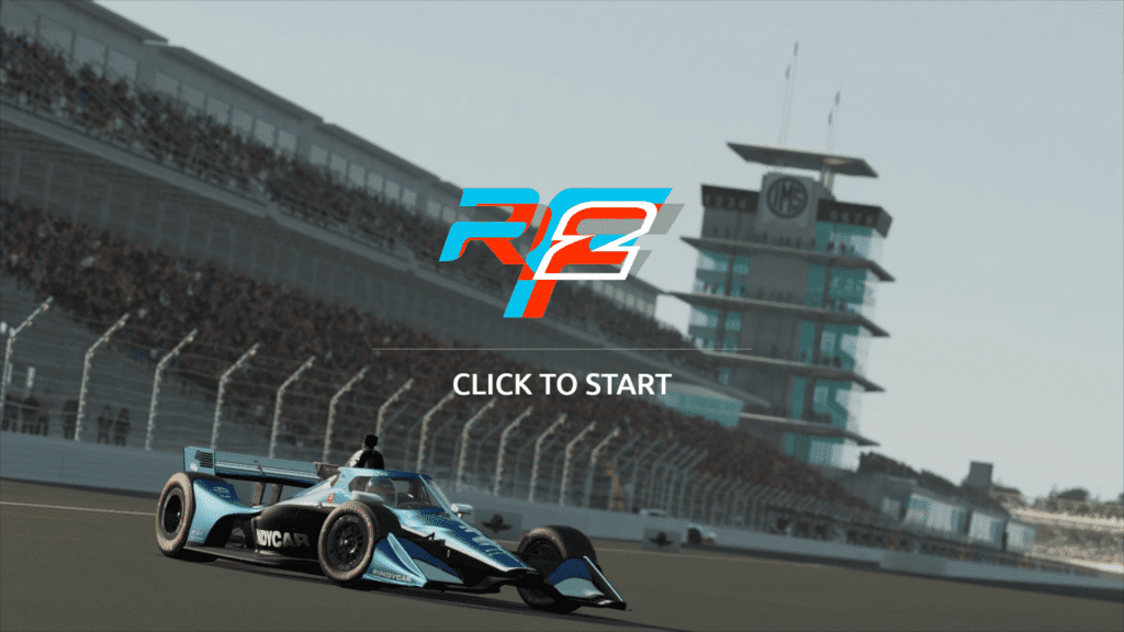
We’re also treated to some pretty videos and stills of rf2 content. The stills look tremendous, with proper depth of field effects and high-res details. Might this be a hint of a photo mode coming in future? It would make a welcome addition for me.
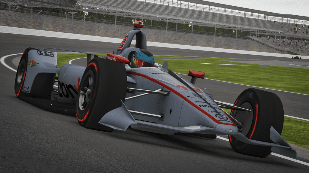
This isn’t the only teaser that comes with the new UI, as we’re shown an IndyCar replete with the aeroscreen. The aeroscreen was mandated to be used from 2020 onwards in the real-world championship, so this would be a new car for rFactor 2. Currently, there is only the older DW12 IndyCar in-game.
Old:
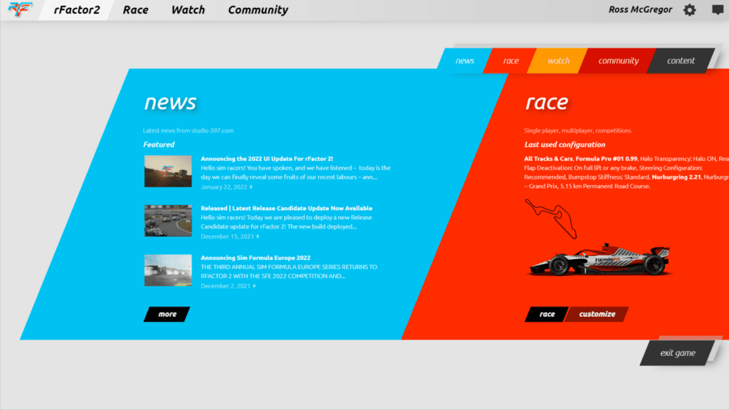
rFactor 2’s player base has long complained about its main menu’s colour scheme and layout.
The new UI update aims to minimise the options available on the main landing screen and remove the S397 inspired colour choices to make everything much easier on the eye. Bright orange, yellow and red doesn’t marry up well as background colours to white text… or any colour of text for that matter.
New:
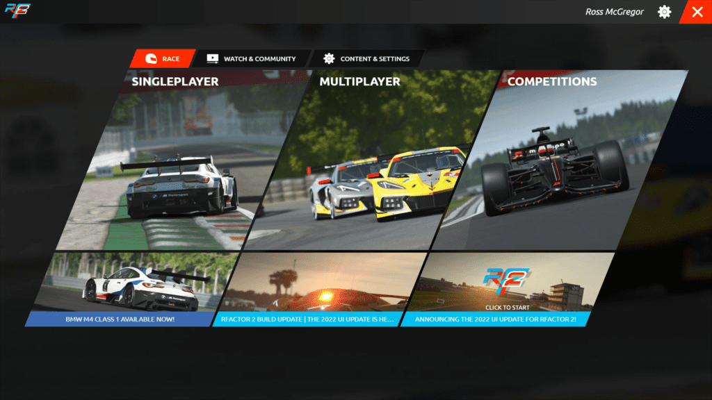
The new UI has a much cleaner look to the main menu by comparison and instantly reminded me of Automobilista 2.
Visibility is crucially enhanced with white text on a dark background. Cutting down on menu options seems like a sensible option. As you can see above, ‘Race,’ ‘Watch’ and ‘Community’ used to appear twice, which simply doesn’t make sense. The update thankfully does away with this.
Settings
Old:
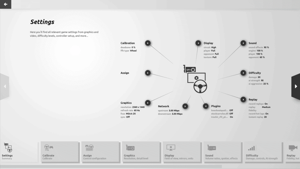
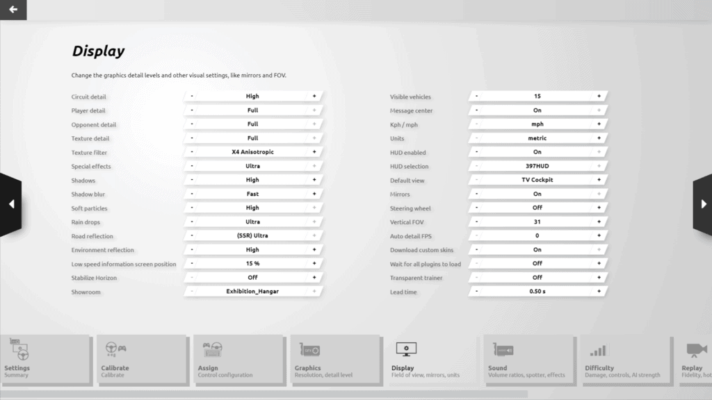
The Settings menus (game settings, graphics, sounds, controls assignation and calibration) have had a welcome overhaul too. The old UI had individual menus for Display and Graphics, which seems a strange distinction unworthy of separate menus, and S397’s drive to reduce clicks and mouse movement looks like it has come to fruition.
Like the old Main Menu, the previous Settings menu features multiple ‘doubler’ options to click, which is quite messy. Then to find the setting you wish to change, you can either navigate the convoluted Mind Map style menu or click arrows to the left or right of the screen.
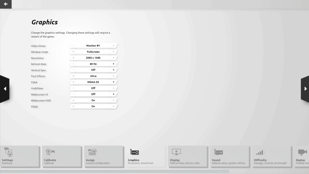
The positioning of the bottom menu is also problematic, as it can potentially be obscured by your average sim racers’ wheel setup.
New:
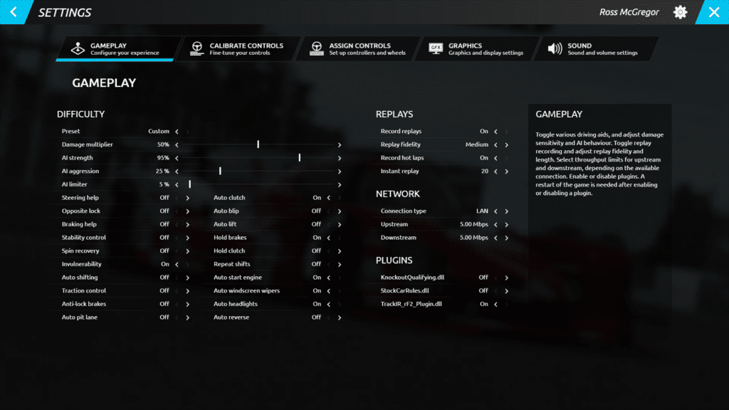
Thankfully, all main options have now been moved to the top of the screen, with options consolidated into fewer screens. It looks much tidier and it’s far easier to find what you require.

Graphics and Display options from the old UI have been joined together into a single Graphics screen. It’s a simple change, but one that makes life so much easier for the rFactor 2 player.
Racing
Old:
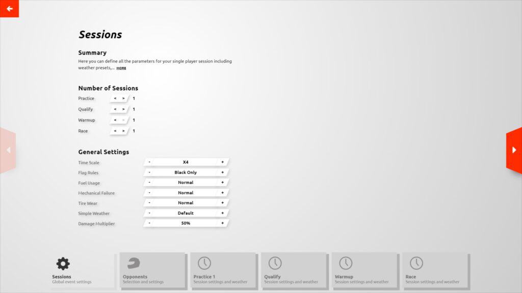

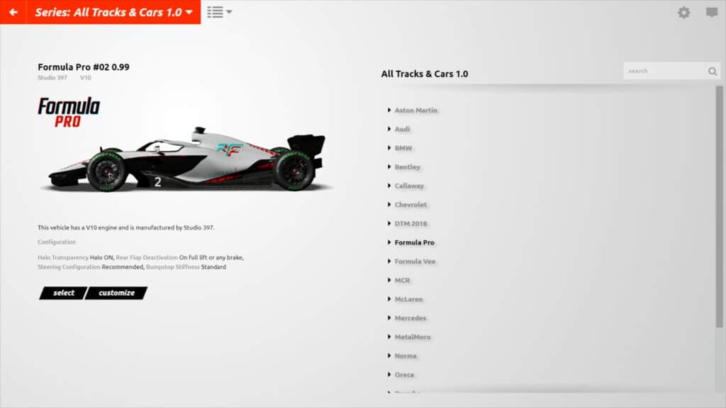
Setting up a race session in the old UI was a laborious process. Yet again, there were too many menus and sliders simply to set up a quick race. Menus options were positioned at the bottom of the screen, making visibility over a sim wheel potentially tricky.
New:
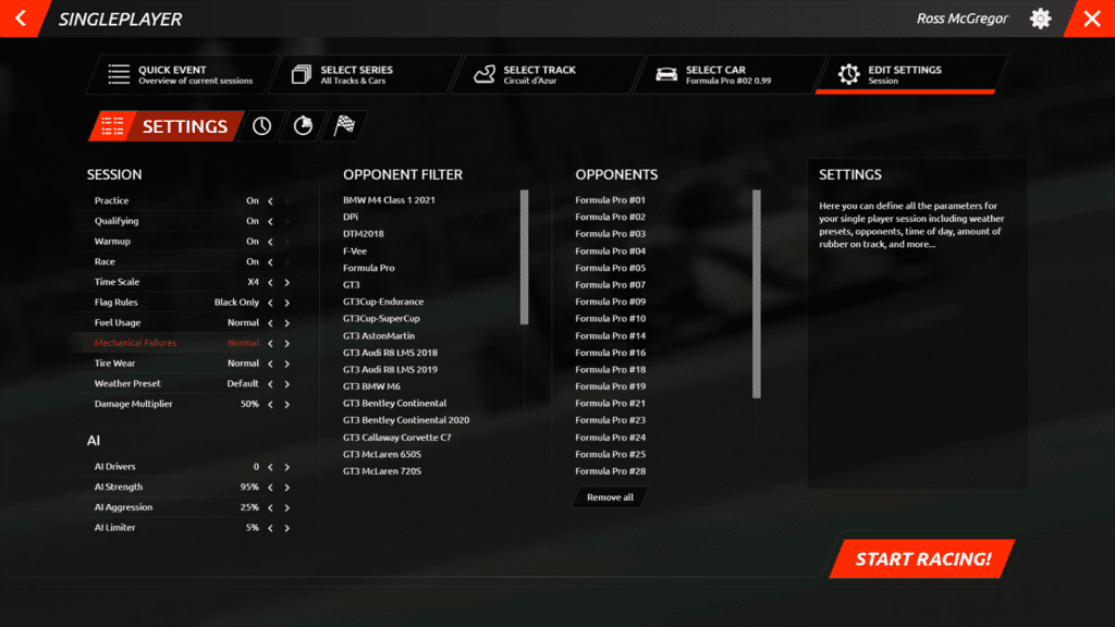
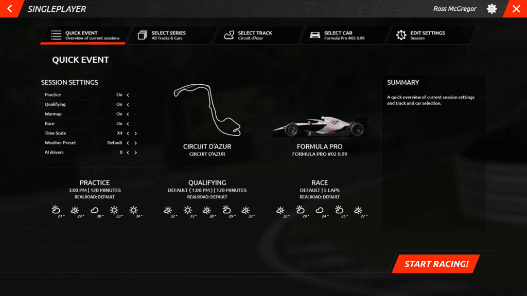
Again, when changing tracks, vehicles and race session settings, the new UI aims to reduce the number of clicks and individual menus the player has to negotiate to provide a more fluid experience.
Car, track and session settings are all accessible whichever screen you’re on, which makes it a vast improvement on the old-style system which featured some agonisingly slow load times switching between sub-menus.
Also note the giant ‘Start Racing’ button on the bottom right – if you’re not one for agonising over the details click this and get ready to hit the track!
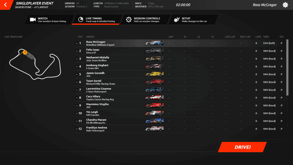
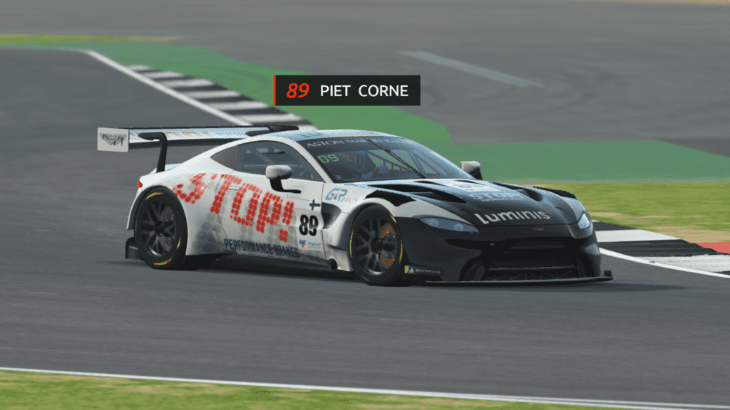
When on track, you’ll notice things like Vehicle Labels are much clearer, so it’s easy to spot who’s about to divebomb you. Likewise, the race standings menus have more information, so you can see which compound of tyres drivers are using.
The dreaded ‘Voting’ button was also lost in a sea of menus before, but thankfully can be found quickly within the Session Controls menu when playing online.
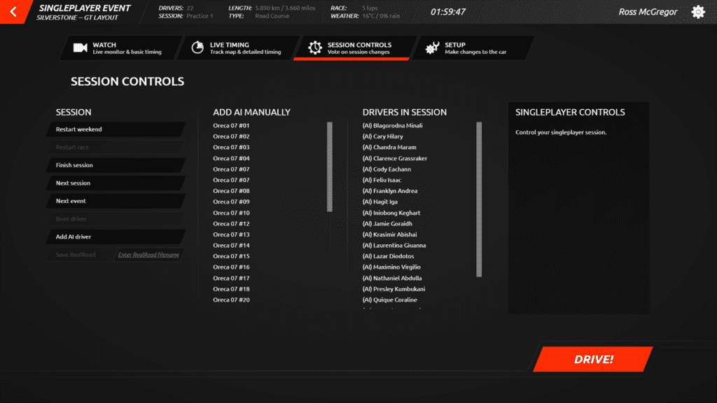
Another interesting thing I’ve spotted is that you can handpick which AI driver you’d like to join the session. Previously, if I was running a single player race and wanted a greater variety of cars on the grid, I’d have to click ‘Add AI’ until I got the car I wanted. Then I’d need to boot the cars that were surplus to requirements.
A time-consuming process that amazingly hadn’t been addressed before. Happily, it’s fixed.
Setups
Old:
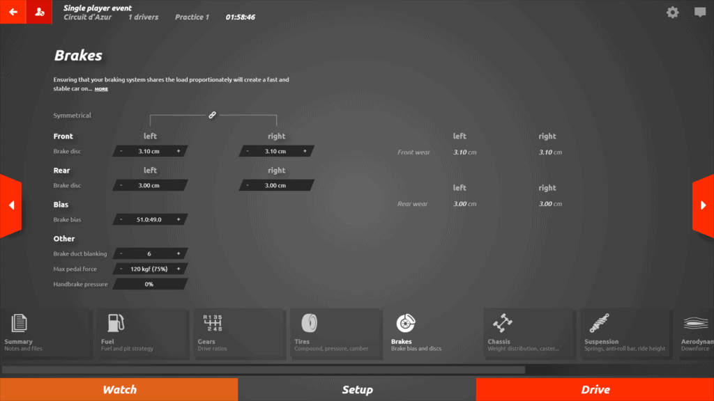
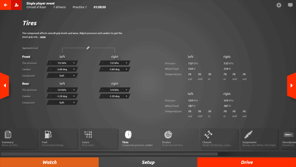
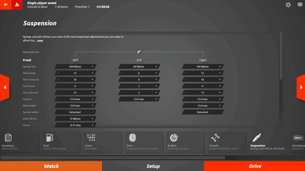
Again, in rf2’s old UI setup options were doubled up. There’s that Mind Map style interface as per the Settings menus again – the exception being Engine options, oddly. Of particular note is the improvement in the suspension settings interface.
New:
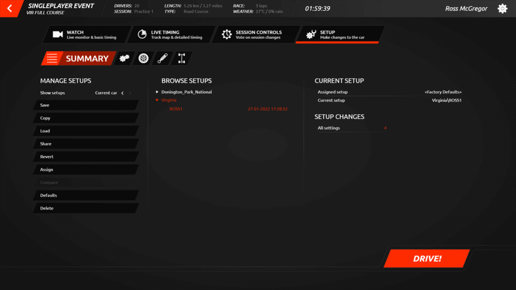
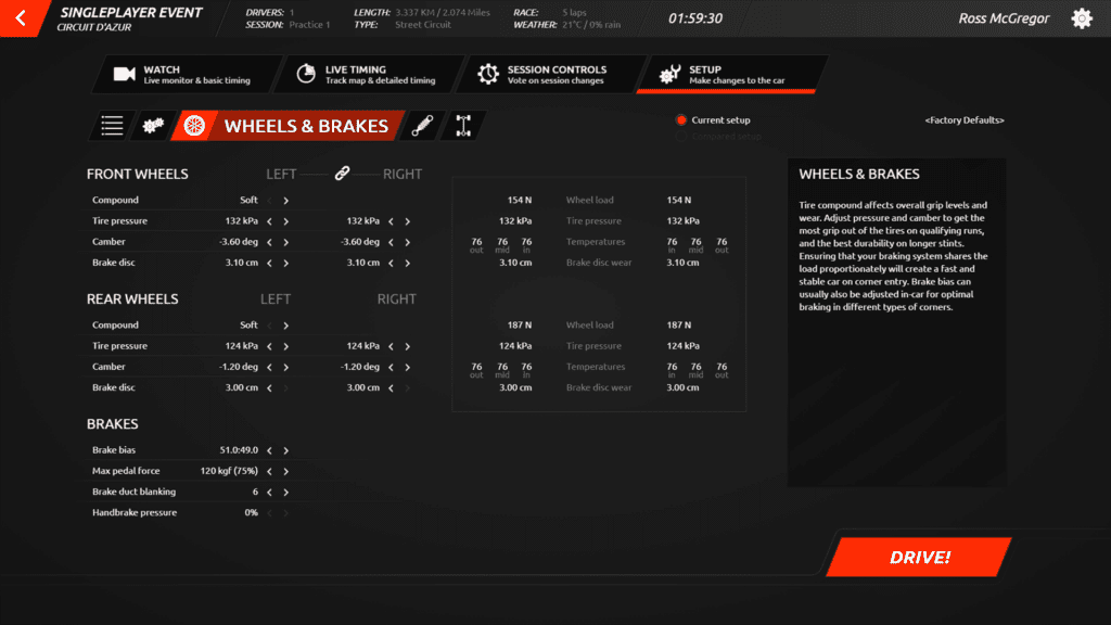
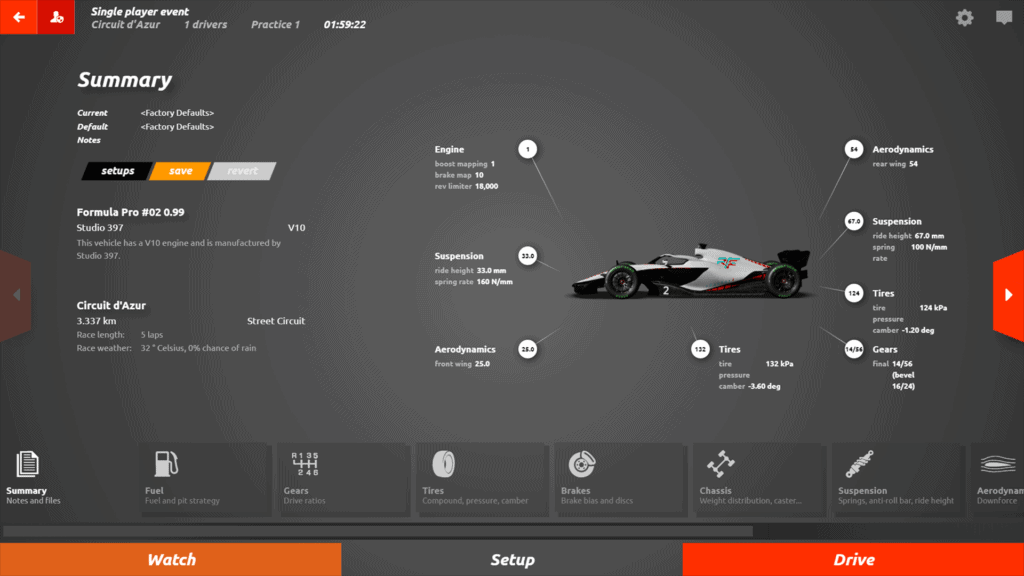
No longer do you need to scroll up or down to amend settings, and aerodynamics have also been lumped onto the same screen, reinforcing S397’s goal of minimising clicks and mouse movements. A big quality of life improvement to the sim, especially for those esports drivers tweaking setups to the nth degree.
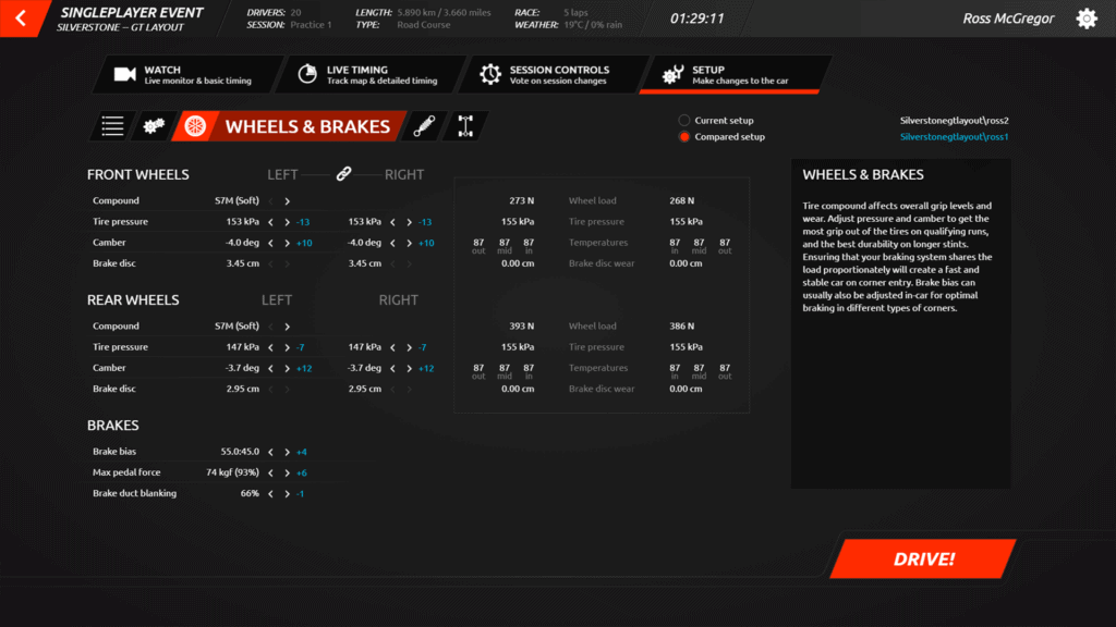
It’s now possible to clearly compare and see two different setups now too. Setup changes were highlighted in orange previously, which was a handy feature in the previous UI upgrade, but the differences between the two setups are highlighted in blue as per the screenshot above.
Although the setup screen is informative, it’s quite text-heavy. Perhaps diagrams in the box to the right explaining setup changes pictorially will provide a bit of engineering insight? It’s not crucial, but it would make setup creation a little more accessible to the average racing game fan. Think along the lines of how Assetto Corsa provides basic setup tips.
Workshop content
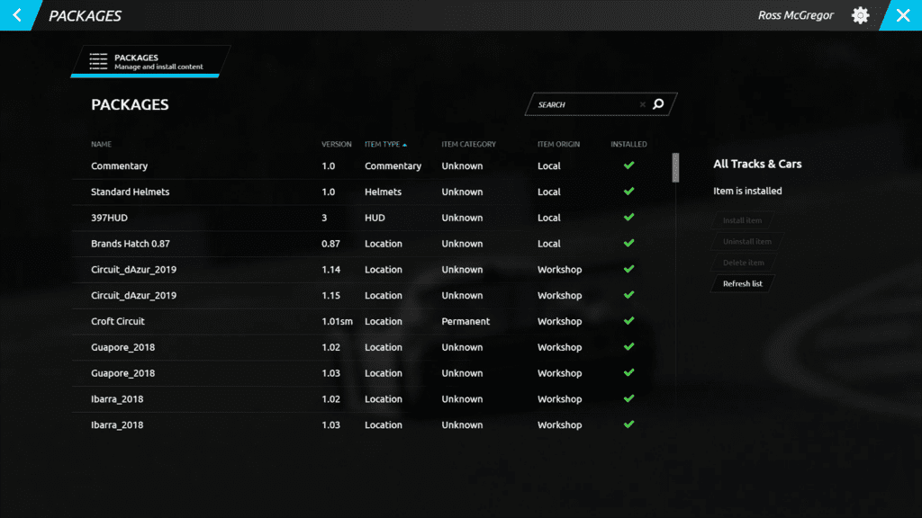
One of rFactor 2‘s most divisive features – one that has been with the sim since its inception – is the Packages system. Some items not found on the Steam Workshop, such as tracks, cars, HUD skins among other game items, have to be installed via a rather clunky in-game menu. Nothing has changed with this, and the UI hasn’t undergone significant changes either.
Which is a shame, as for those rFactor 2 players with a lot of content installed can quickly get lost in a sea of tracks and mods. It’s also not clear why you need multiple versions of some official S397 content installed concurrently. It’s a confusing system.
Thankfully, subscribing and unsubscribing to content via the Steam Workshop is easy enough, but be prepared for a bit of a delay while the game installs it all the next time you start it up!
Showroom
Old:
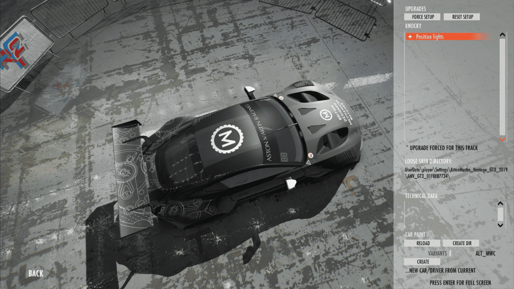
The old showroom background didn’t display cars to their maximum potential, especially if they had darker liveries like the Aston Martin above. The floor was shiny grey concrete that reflected simulated artificial light from above, so it was a little bit messy.
New:
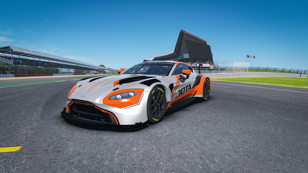
Those keen of sight may have spotted a new Showroom location in which to take pretty screenshots of your favourite race cars.
The straight outside the Silverstone Wing building is the headline vista, although you cannot change the placement of the car at this stage. The previous Showroom has been given a bit of an upgrade, and looks far better in comparison, with a less distracting floor and background.
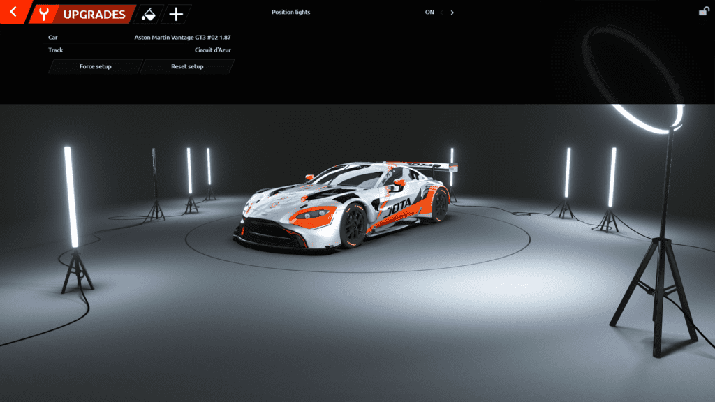
Having a completely neutral palette of colours without reflective surfaces puts the vehicle front and centre, with minimal distractions to take the eye away from what’s important – the car and its livery.
Note the padlock symbol in the top right of the screen as this allows the player to lock or unlock the top menu. Not a ground-breaking feature, but just another quality of life improvement to make the rFactor 2 experience more user friendly.
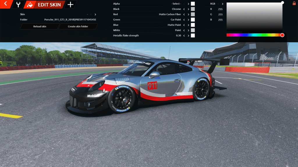
Painting and creating a new skin within the game is also much easier thanks to the greater visibility offered by the new UI and Showroom locations. It’s possible to create a decent-looking livery for your custom team in a couple of minutes, although my tinfoil-covered Porsche probably isn’t the work of art I’d hoped for…
Competition system
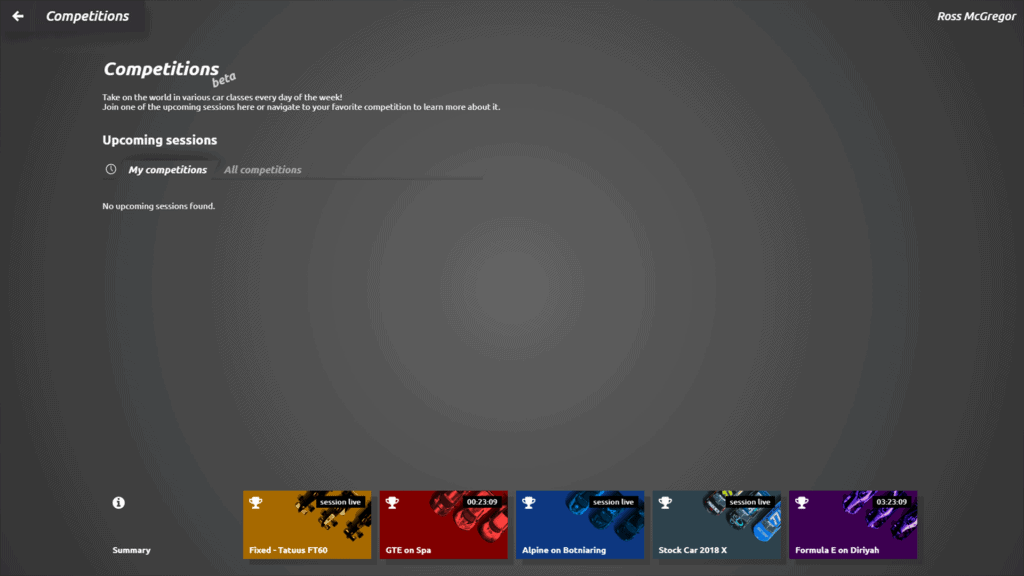
Interestingly, the Competition System menu has not changed at all, it still uses the jarring old UI. We hope this moves to a fresh design, and with rFactor 2 being used extensively in top-level esports competitions it wouldn’t be bold to predict that the whole system will change for the better in future.
That’s it for a quick overview of the rFactor 2 user interface changes, but of course, those delving into it over the next weeks and months will find more changes and potential areas for further improvements. Be sure to let us know your thoughts in the comments below.
Full disclosure – Traxion.GG is part of Motorsport Games and the Motorsport Games family of brands. All Traxion.GG content is editorially removed from Motorsport Games video game development and created by a dedicated team.


Chat with the Community
Sign Up To CommentIt's completely Free